Overview of the Layout Practice
Inspired by the 100 Days of Code and 100 Days of UI challenges, I sought to work on a new layout each day. I set the following parameters for myself:
- Pure HTML/CSS (no JS in these basic layouts)
- Responsive/mobile first
- Utilize Grid and/or Flexbox
- Explore different aesthetics/styles
Originally, I looked for some inspiration by examining some layout and design trends for 2018 to use as a launch point. I had a few styles in mind and general goal. For this reflection, I’m going to share screenshots and a brief walkthrough of each of the first 3 layouts. I’ll then share the remaining ones in a second post. Ultimately, I’m going to build a theme out for my site (not necessarily any of these). For now, I’m going to share a few screenshots and some reflection on the process.
Note: Some of these are not very practical — they’re responses to stylistic design challenges I set out for myself.
I’m going to present these in the order I made them. The names are just working titles to help with organizing the screenshots.
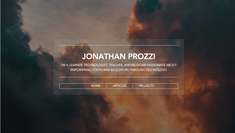
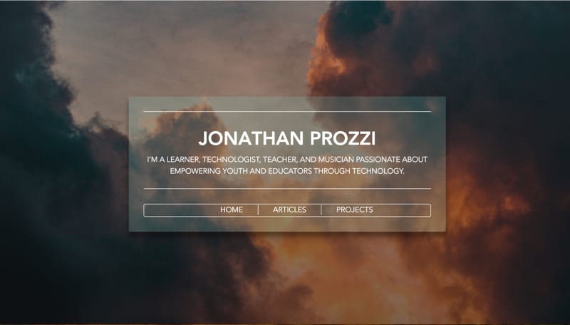
Layout 1: “Dark Cloudy”
Background image credit: Jason Wong
This is the first layout that I made in this series, and I added in my actual site title and tagline. I wanted to use a stark image and found this one on Unsplash.
I wanted to experiment with gradient overlays and opacity to alter the mood of the site. I decided on a centered ‘card’ type layout with clean, white text. When you hover over this card, there’s a slight box shadow and overlay change to draw attention.
The card and menu are done with Flexbox. Since this was my first attempt, there were definitely some things I learned and would improve for next time. After the next several layouts I gained more of an understanding of Flexbox and would lay out the card and navigation in a much more precise way.
Desktop Layout (No hover):
Desktop Layout (Hovering over card container):
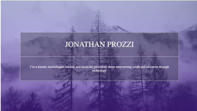
Layout 2: “Purple Peaks”
Background image credit: Lindsay Malatesta
This layout is similar to the previous one and is built with many of the same concepts. This site also uses Flexbox for the whole page layout. After this layout, I determined to use Grid for general page layout and then Flex for smaller container layouts such as navigation menus. The general idea for this was to use a stark background image with gradient overlays and different opacities for different site components.
Desktop Layout (No hover):
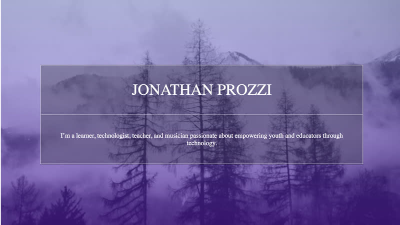
I had the idea to change the opacity of the container to draw attention to it from the background. The background and gradient are the same as the full page overlay, but the opacity is slightly different to separate the component visually. I wanted to use a basic split box layout with the name and tagline separated by slight white borders.
I then added a hover effect that darkened the container component while lightening the background overlay.
Desktop Layout (Hovering over container):
Layout 3: Grid Playground!
This isn’t so much a layout as it was an experiment with CSS Grid. I became very interested in using Grid to create a series of overlapping elements. Previously, this would be a rather difficult layout to achieve as you’d need to use absolute positioning — which comes with its own set of difficulties.
I was initially inspired by wanting to create grid layouts modeled after Piet Mondrian’s art. I started laying out my grids in a manner similar to some of Mondrian’s famous paintings, using similar colors. I then moved into a more pastel color palette and started experimenting with transparency and opacity:
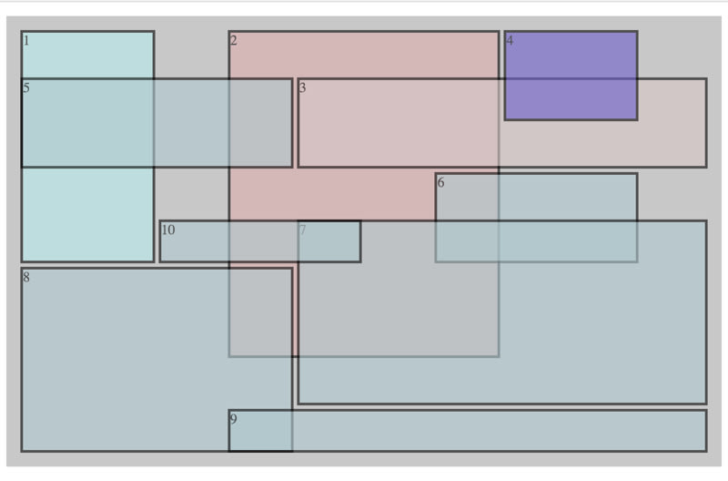
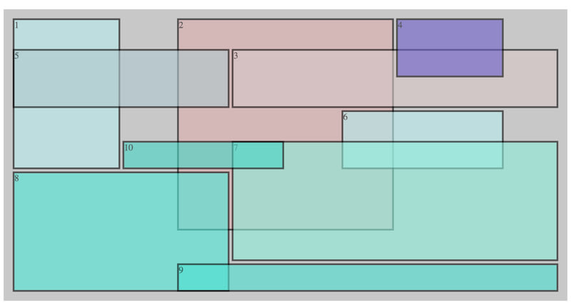
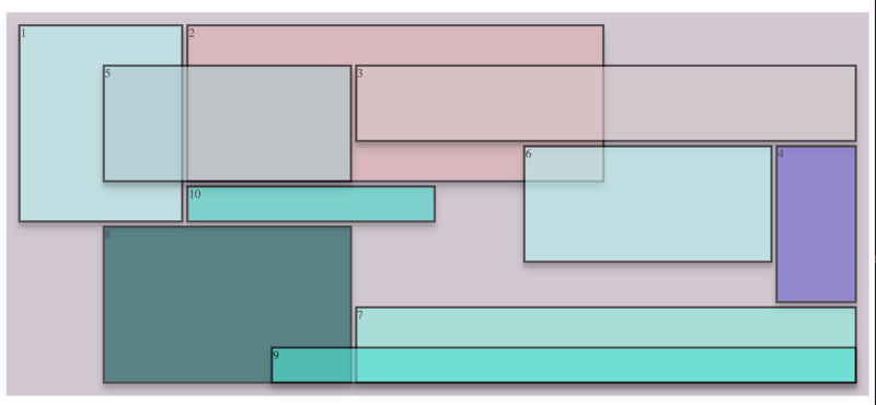
I used this as a fun playground for creating unique, non-traditional layouts for a site. This isn’t necessarily a practical layout (maybe it is in some other web dimension), but it was a really fun way to boost my Grid skills. After this series of layout experiments, I became much more comfortable using grid-template-columns, grid-template-rows, and grid-areas. It took some practice to understand how to position and overlap the grids, but I had a lot of fun with it!
I want to create a small JavaScript app that creates generative art using Grid and a color palette.
More Layouts!
I have more layouts that I’ll be writing up, but I’m going to outline the rest of the layouts in Part Two of this post series.