At this point, I became more comfortable with using CSS Grid and Flexbox together, and knowing when/where to use each. These layouts use combinations of both tools.
Note: Some of these are not very practical — they’re responses to stylistic design challenges I set out for myself.
These are presented in the order I made them. The names are just working titles to help with organizing the screenshots.
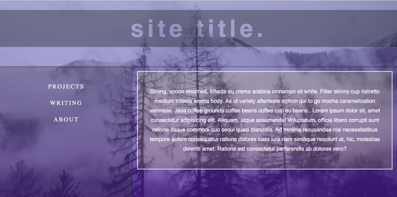
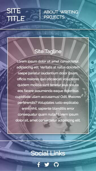
Layout 4: “Purple Peaks Transparent”
Background image credit: Lindsay Malatesta
While working on the Mondrian style grid layouts outlined in the previous post (Layout 3), I had an idea. I wanted to set a background image on either the body or container and then create several grids with different opacity levels/overlays. The thought was to mimic what different panes of glass sitting on an image would look like. I created the general site layout with Grid and wanted to experiment with using knockout text for the site title.
I placed a darker overlay on the site title grid and then wanted the background image to shine through the knocked out site title text. The image doesn’t come through as much as I wanted, but I did accomplish the effect.
I experimented with different opacities and overlays for each of the main sections, with a darker gray background for the ‘content’ area. The sidebar menu has an even darker overlay to provide some distinction.
Desktop Layout (No hover):
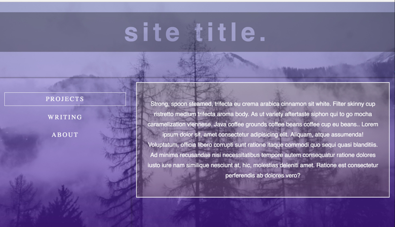
Desktop Layout (Hovering over sidebar menu):
When hovering over the sidebar, the dark overlay vanishes and a slight white border appears around the menu items:
I enjoyed working on this layout and there are aspects that I like and may consider using again. I want to keep refining this layout because I do like the starkness and the different opacity overlays on an image (with gradient overlay on it as well).
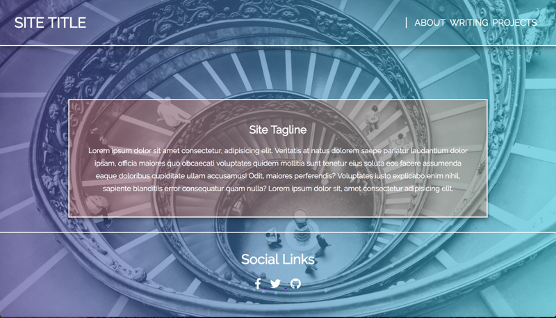
Layout 5: “Spirals and Gradients”
Background image credit: Jamie Goodwin
I had 2 main objectives for this layout. First, to practice mixing gradients for different parts of the grid. Second, to layout the core page elements with Grid and individual elements (such as the header and footer) with Flexbox.
I wanted an interesting background image that I’d lay gradients over, and I found one that had a neat spiral effect when I used it. I created a purple -> teal gradient for the main body, and then used an orange one for the center grid. The center container has a slight box shadow on hover.
The header is simple, white text with some slight hover animations that collapses in the mobile view.
Desktop layout:
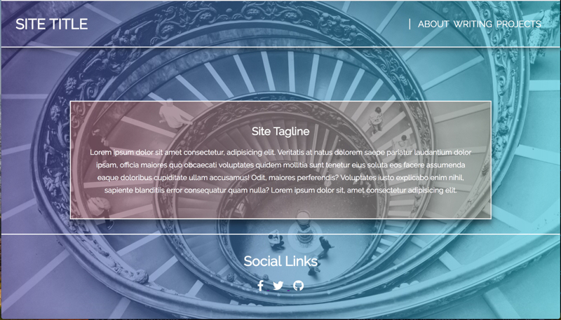
Desktop layout (Hovering over center content card):
Mobile layout:
Given that I wanted to avoid using JavaScript in these layouts, I opted for a squashed Flexbox menu instead of a ‘hamburger’ style mobile layout.
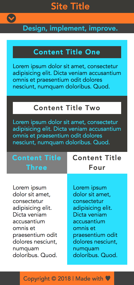
Layout 5: “Blocky”
I wanted to experiment with a bold, blocky text layout with bright colors. I chose the grays and teal first. Then I selected the orange as a complimentary to the teal. I designed this one entirely mobile first and like the mobile layout far more than the desktop.
The main layout is made with Grid and the footer and individual content boxes use Flexbox. I also broke my rule and included a bit more than just pure HTML/CSS with this, as I used a Font Awesome icon for what would be the drop-down menu in mobile. This could be recreated as a SVG instead.
For this layout to work functionally, I’d need to use some JS for the drop-down menu.
Mobile:
Desktop:
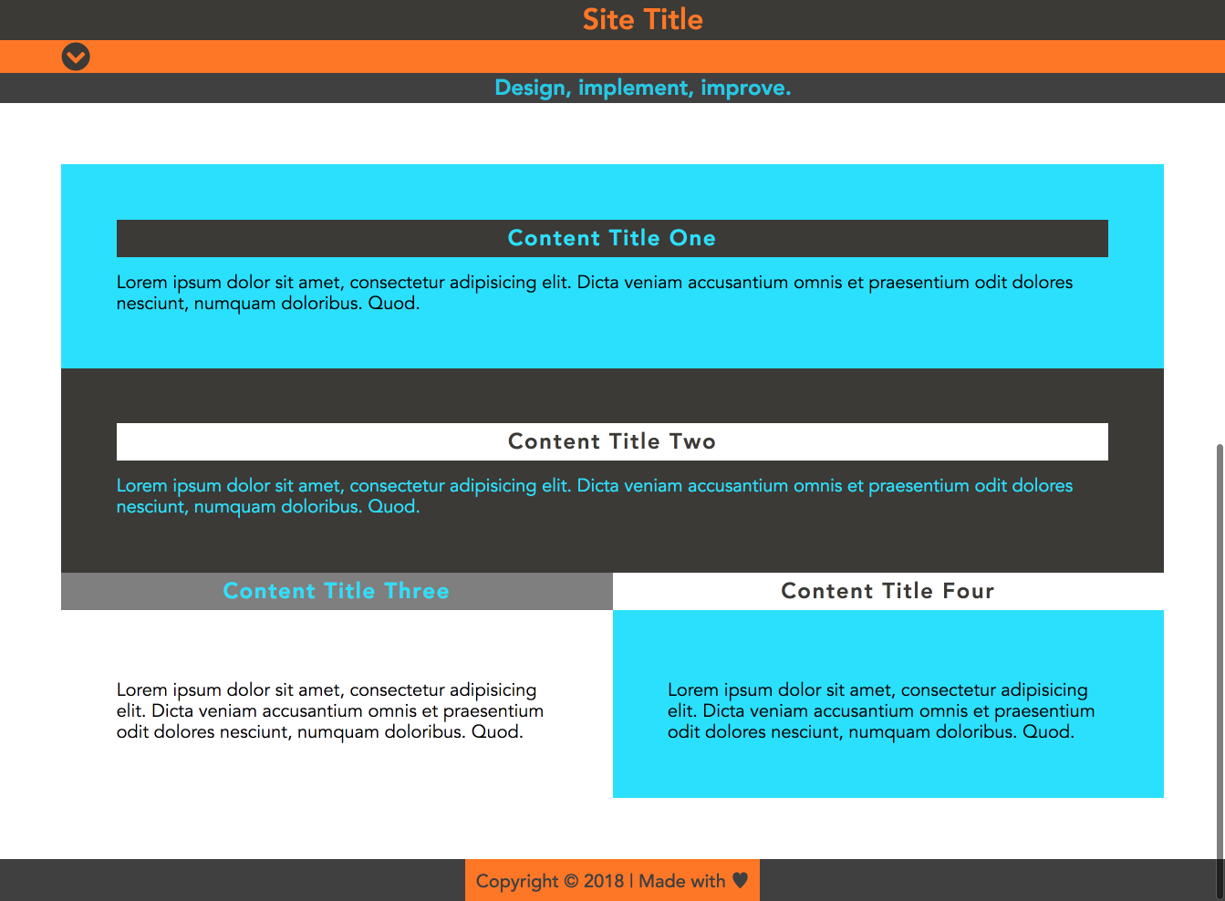
I’m less happy with the desktop version. It’s a lot busier than I’d actually use, but I accomplished what I set out to do.
Layout 7: “Blocky Blog Post”
Featured image source: Krivec Ales on Pexel
I wanted to experiment with using CSS Grid overlaps in a practical setting. I only designed a mobile version of this. This is a mockup for a blog post. The featured image has the title and a subtitle overlapping with it, and some clean text with link colors that match the accent colors used in the titles. The hover state for the links changes the background color of the anchor text to the main accent.
Mobile:
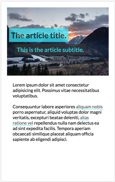
I’ve yet to make a desktop version of this layout, but I’m pleased with how this one turned out!
Conclusion
I had a great time with this series of layouts. I’ve been able to build a lot of skill in a short time. I plan to continue my explorations using Grid and Flexbox as I work through different layouts and aesthetics. As I add more, I’ll add them to the series!